
Coronapostas — 2020
Coronapostas — 2020
A series of posters based on my thoughts of quarantine and COVID-19 (Coronapostas), with a focus on trying out new tools and techniques to
give better opportunities for expressing the creativity behind my designs.
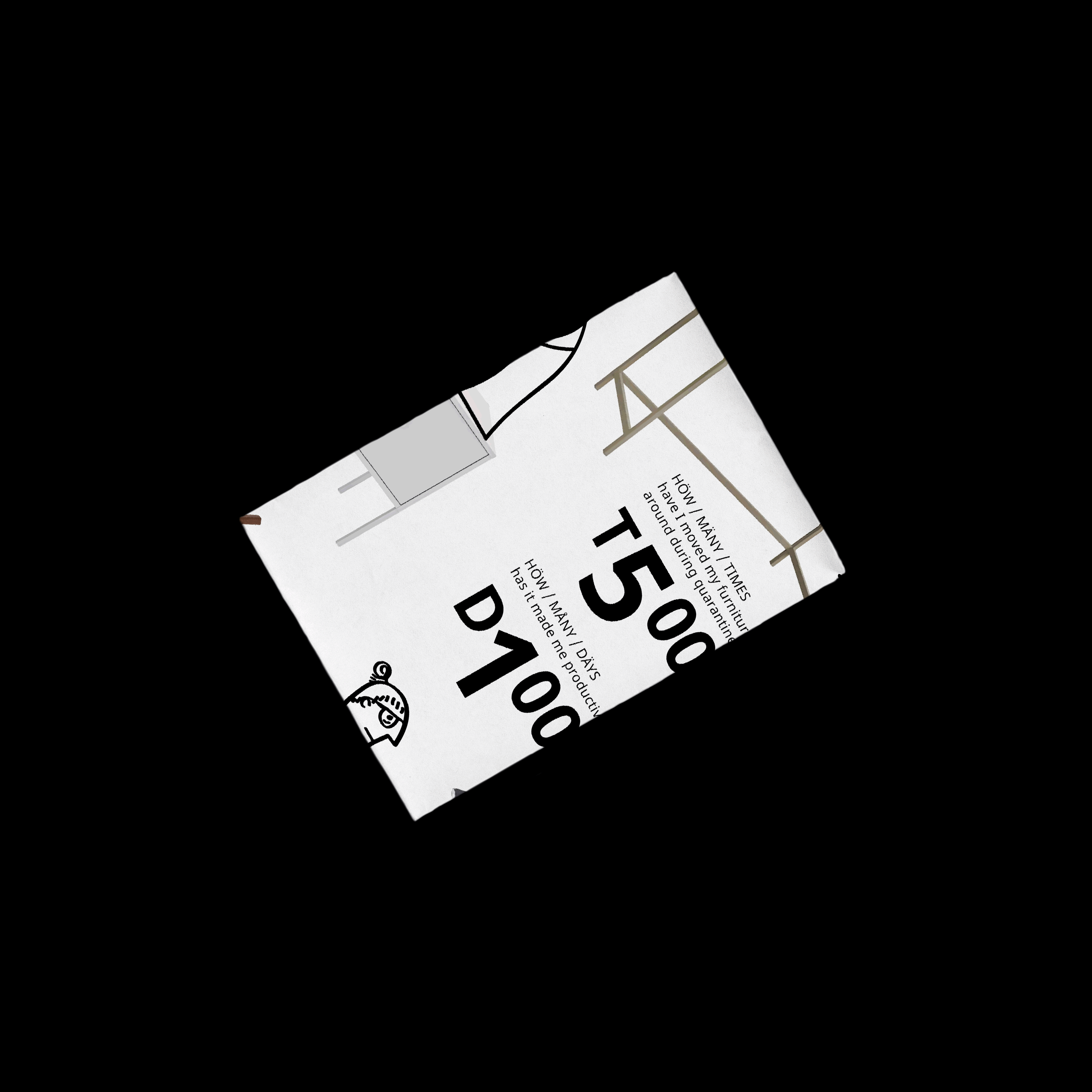
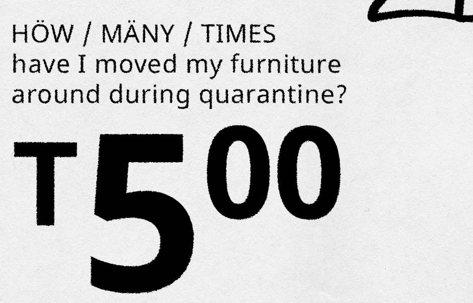
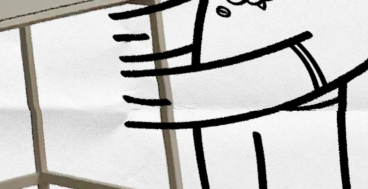
The IKEA-styled poster is a depiction of the difficulty for me to be productive and happy without the work-life separation and stability of both different work and living spaces, and face-to-face guidance from tutors. It shows me moving my furniture around way too many times, as an attempt to create a space I could be productive in.
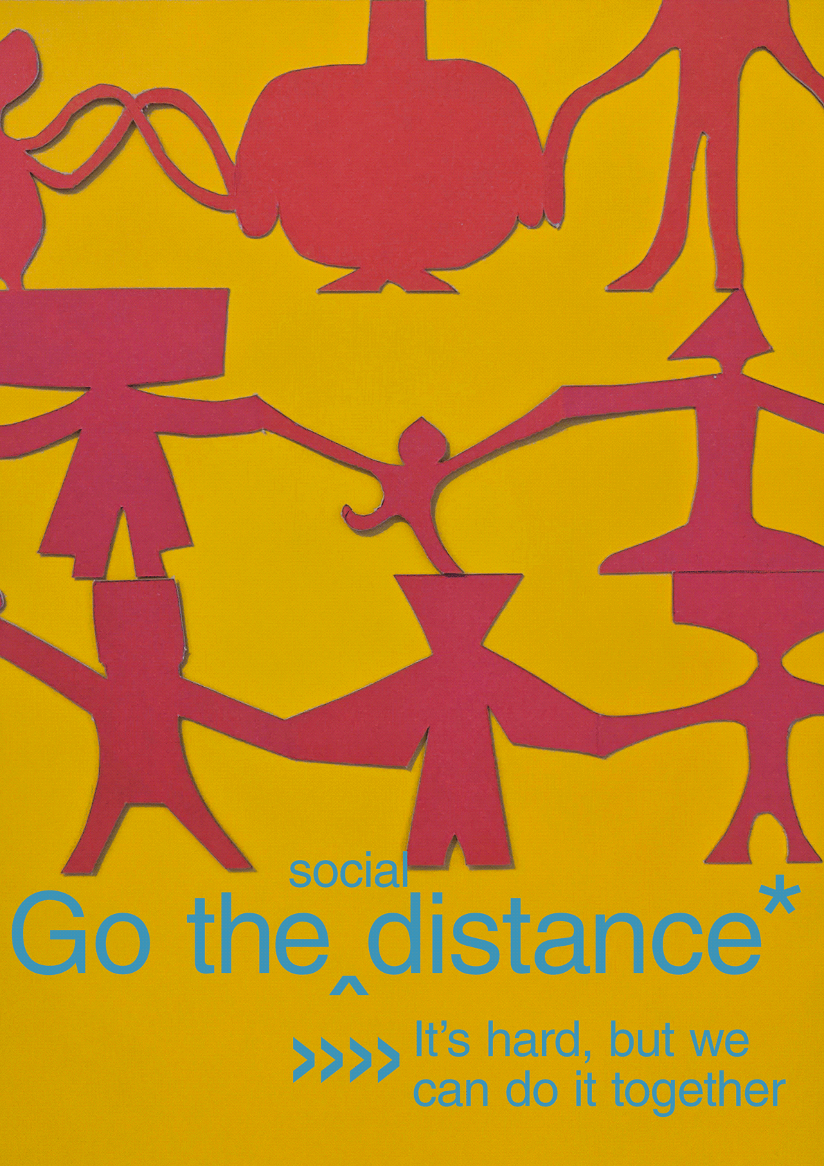
At the time, lot of artworks were being made about the situation with the virus, which us what inspired me to design my own works to help put into words what I was feeling: Social distancing and quarantine is hard, but we can do it together... now is the time to be closer and help each other. For this, I made a poster with the materials and tools I had at-hand; paper, scissors, and my phone.
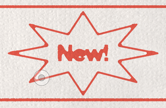
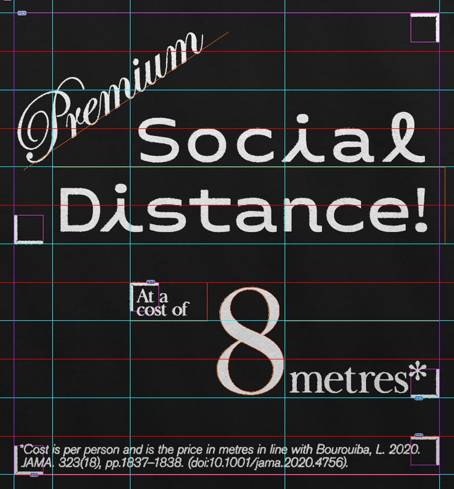
The purpose of the next three designs is to comment on the inadequacy of the two-metre social distancing rule, with the context of research that says social distancing is not as effective until an around-eight metre distance is observed.
They criticise the reasoning for the ‘one metre plus’ rule for the purpose of ‘opening up the economy’ — social distance reduction for the price of a pint, as it would end up prolonging lockdown, and as it contrasts to the lateness of the lockdown compared to most other countries.
The IKEA-styled poster is a depiction of the difficulty for me to be productive and happy without the work-life separation and stability of both different work and living spaces, and face-to-face guidance from tutors. It shows me moving my furniture around way too many times, as an attempt to create a space I could be productive in.
At the time, lot of artworks were being made about the situation with the virus, which us what inspired me to design my own works to help put into words what I was feeling: Social distancing and quarantine is hard, but we can do it together... now is the time to be closer and help each other. For this, I made a poster with the materials and tools I had at-hand; paper, scissors, and my phone.
The purpose of the next three designs is to comment on the inadequacy of the two-metre social distancing rule, with the context of research that says social distancing is not as effective until an around-eight metre distance is observed.
They criticise the reasoning for the ‘one metre plus’ rule for the purpose of ‘opening up the economy’ — social distance reduction for the price of a pint, as it would end up prolonging lockdown, and as it contrasts to the lateness of the lockdown compared to most other countries.


Subverted Jobcentre Plus Advertising Pack
Subverted Jobcentre
Plus Advertising Pack
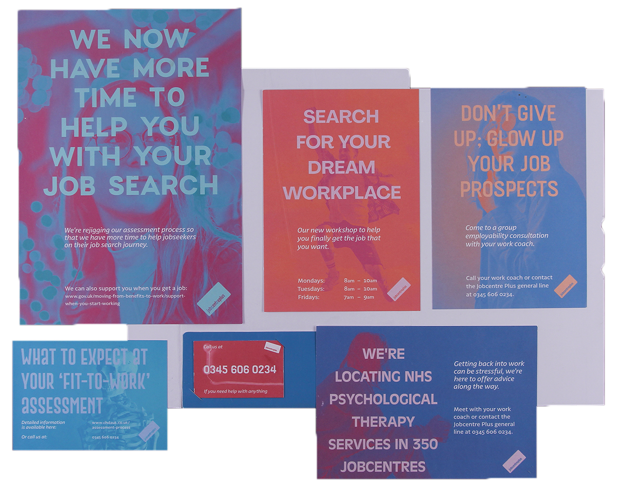
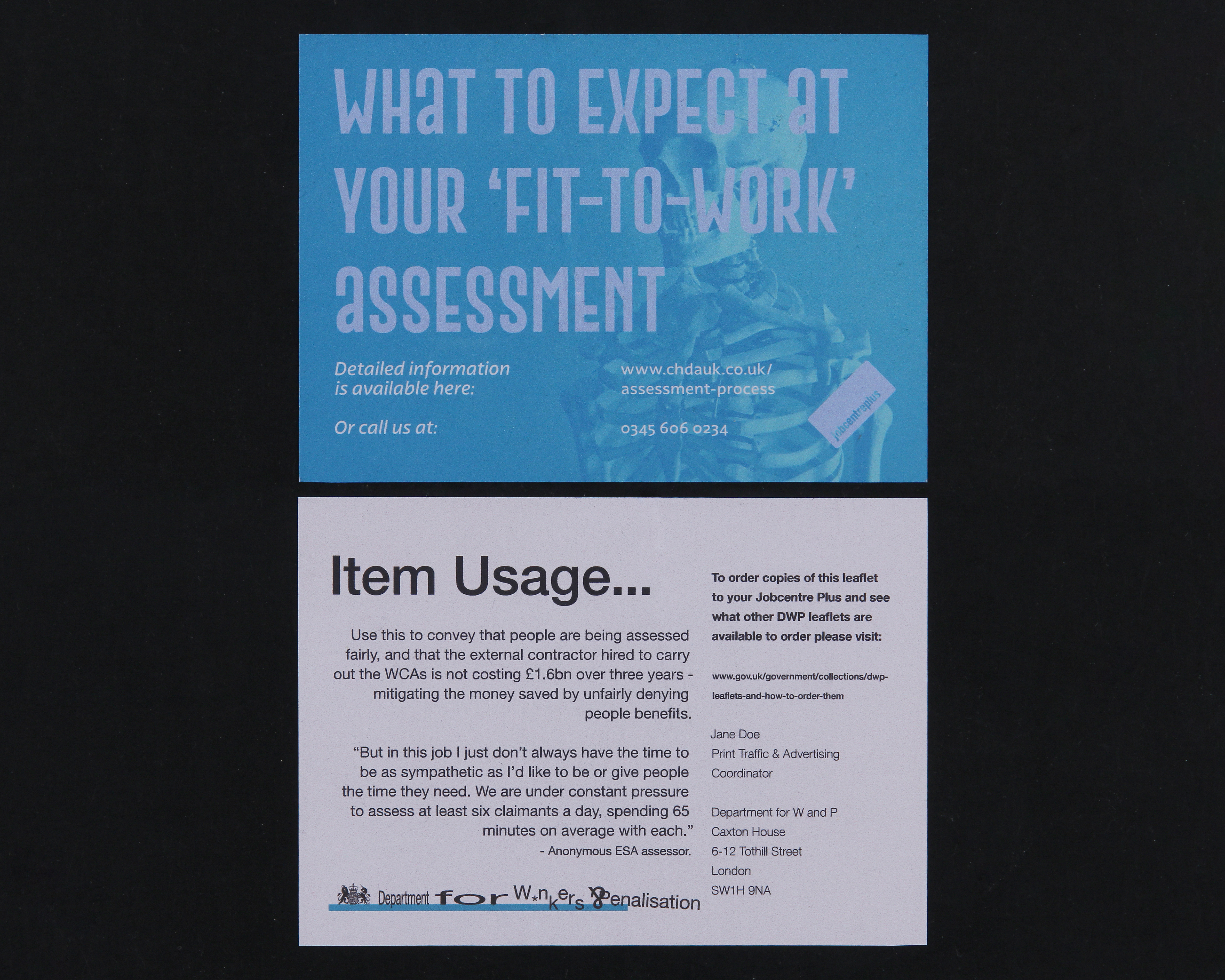
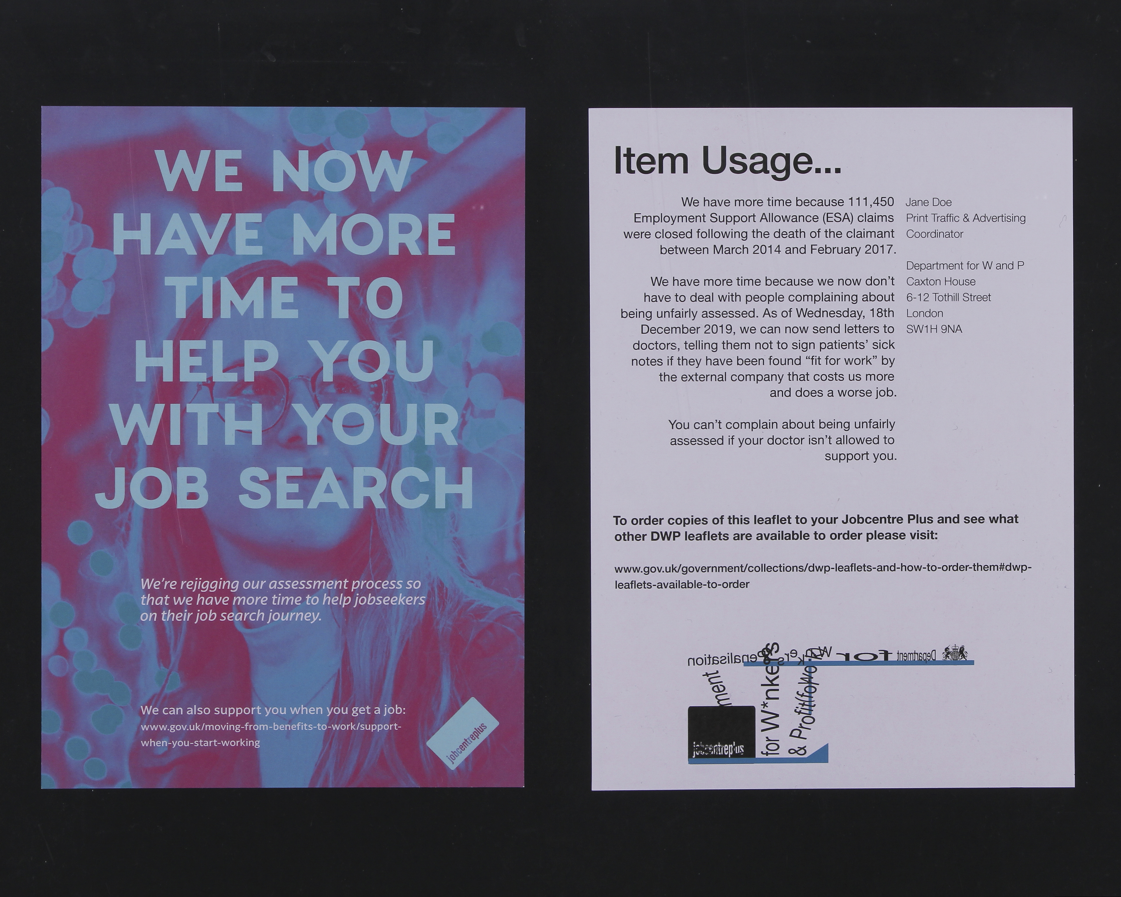
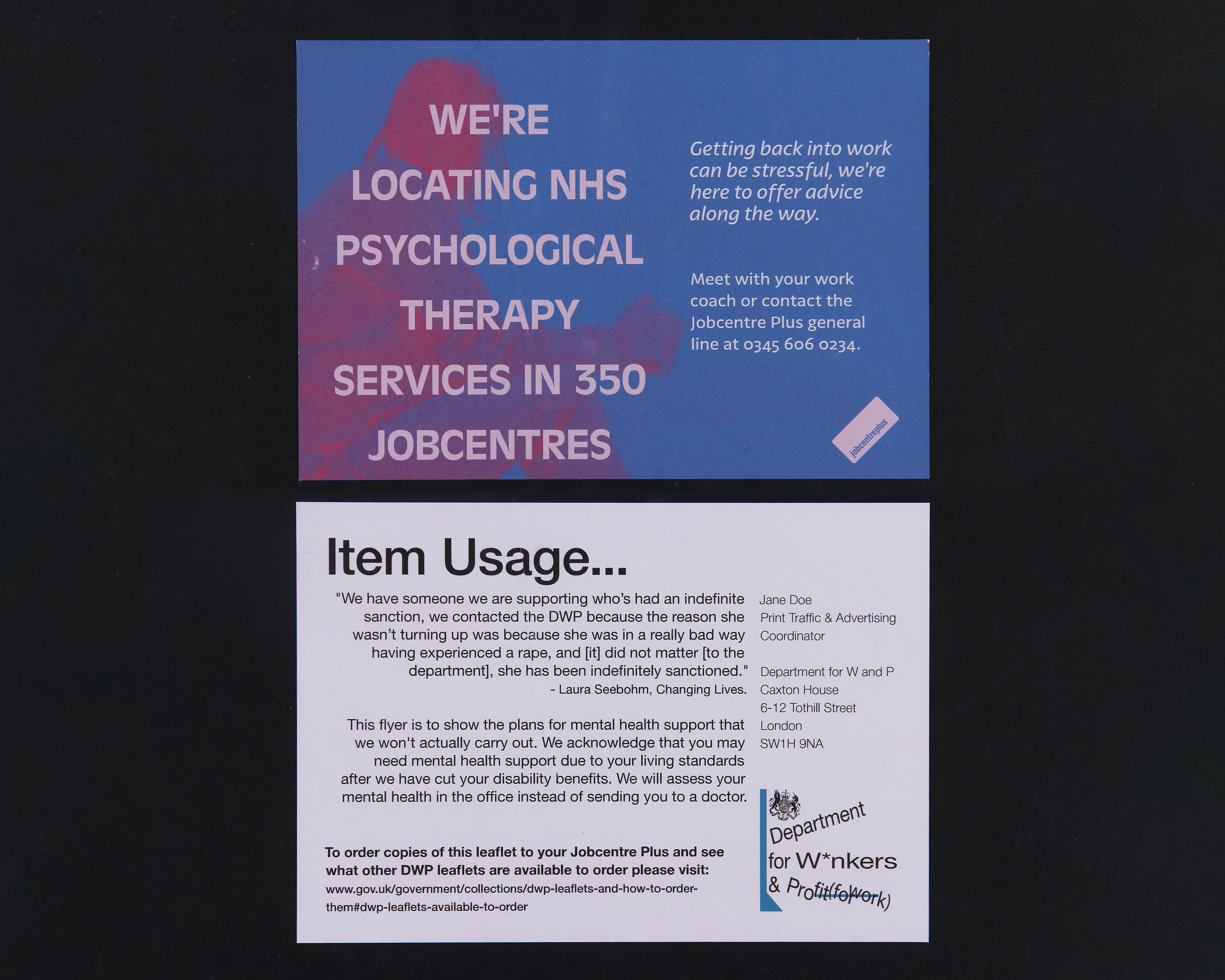
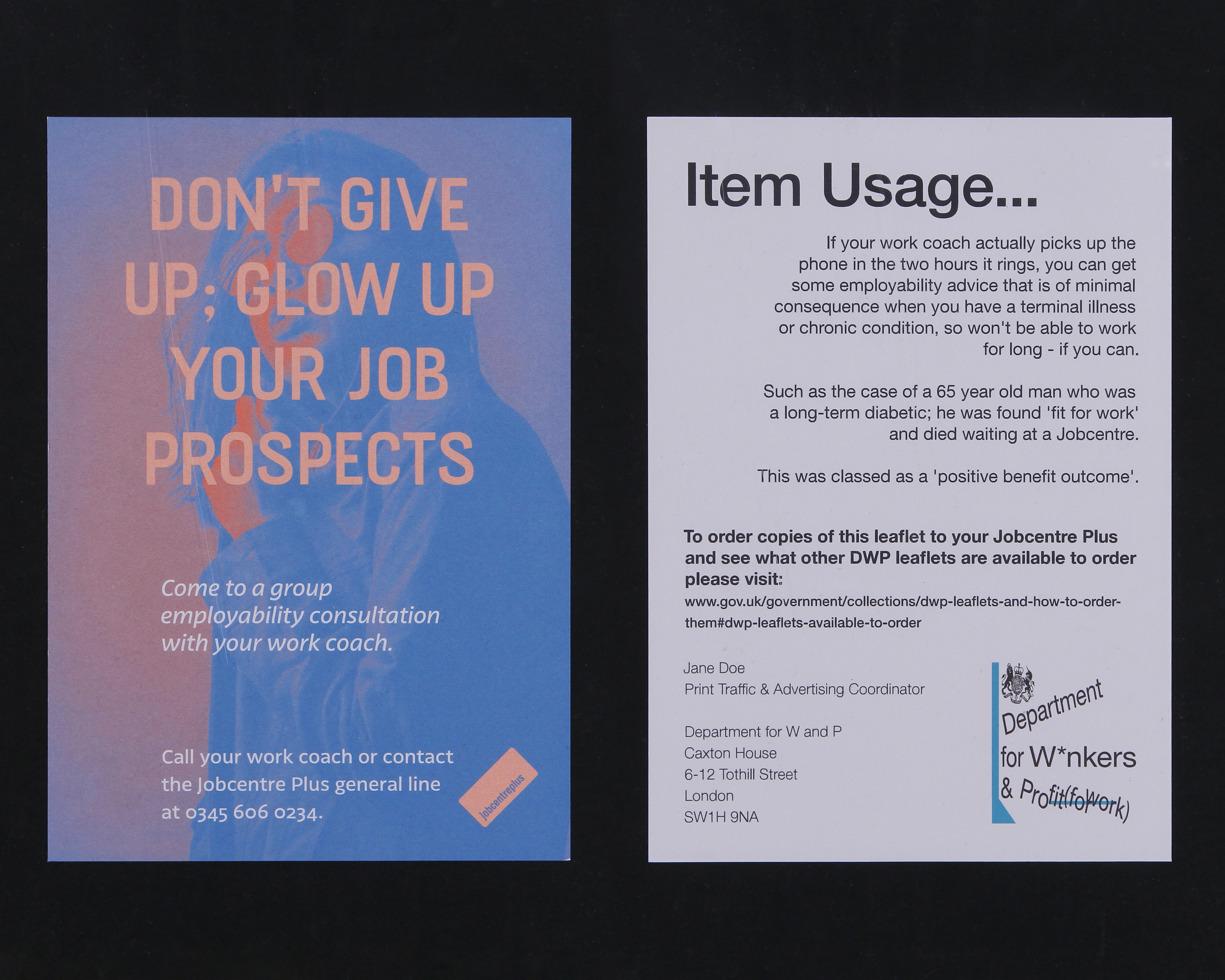
An employee has taken it upon themselves to subvert a new (and expensive) DWP advertising campaign for Jobcentre Plus, to protest the truth of the messages portrayed in the print materials.
*A project inspired by the mistreatment of vulnerable and disabled people by the Department for Work and Pensions, as well as lies and such in their advertising material.
The deliverables are examples of an advertising campaign that is similar to a newspaper run which led to the DWP getting sued for untruthful claims. The fronts of each deliverable are subtle in their subversion — just being a good example of an obnoxious advertising campaign that glosses over the issues people face, by using stock photos of happy and able people, and doesn’t represent the people that need help the most from the service.
No care is given to the colour blind or visually impaired in the designs, hinting that the department which authorised the campaign didn’t consider the needs of the people they are tasked with helping.
The back side of each product responds to the claim on its face from the point of view of the subverting employee, and subverts all of the rules for page layout and logo use in the DWP’s brand guidelines document.
All of the back-side text is based on real events and facts involving the DWP and Jobcentre Plus, including stories from news stories and Google reviews.


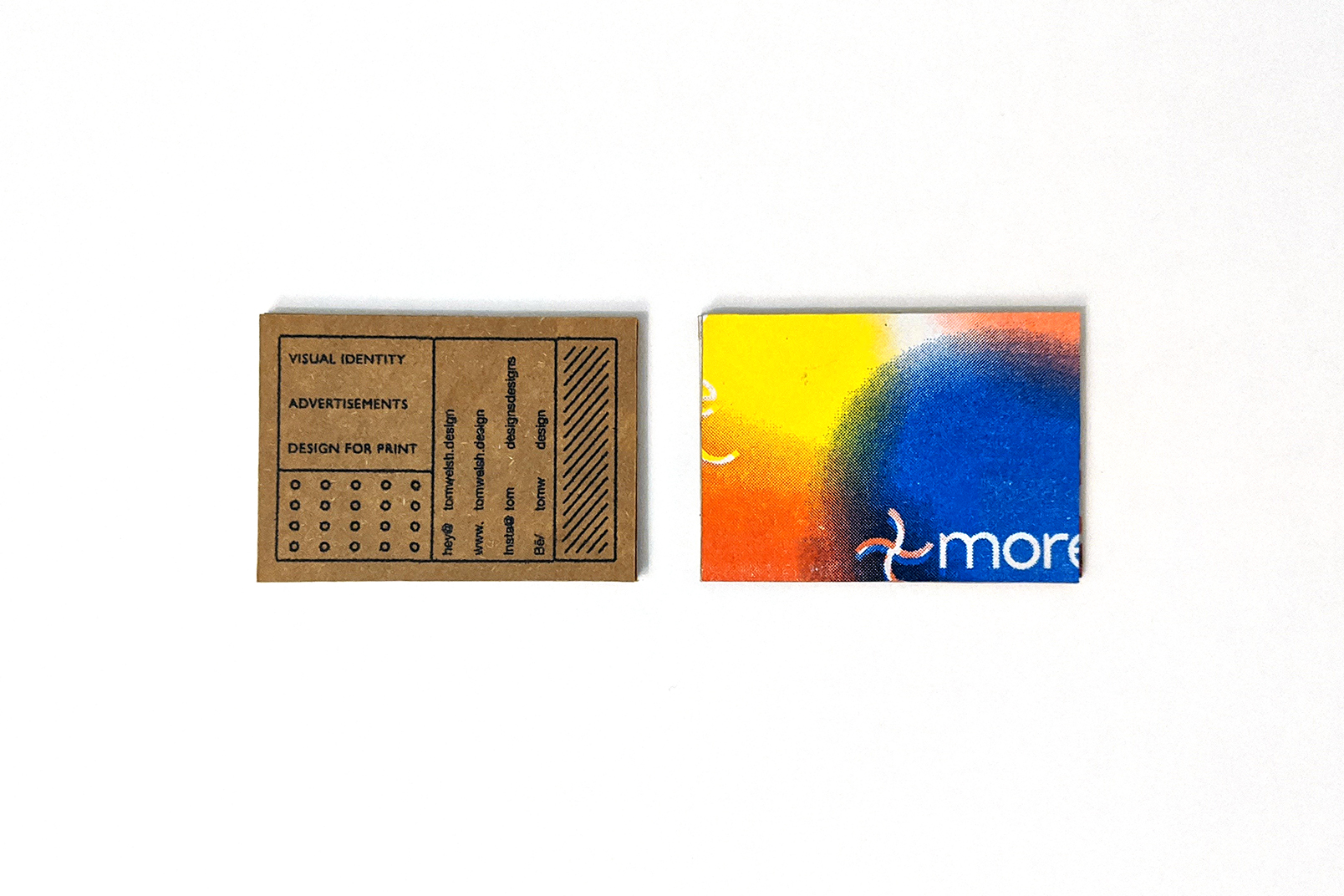
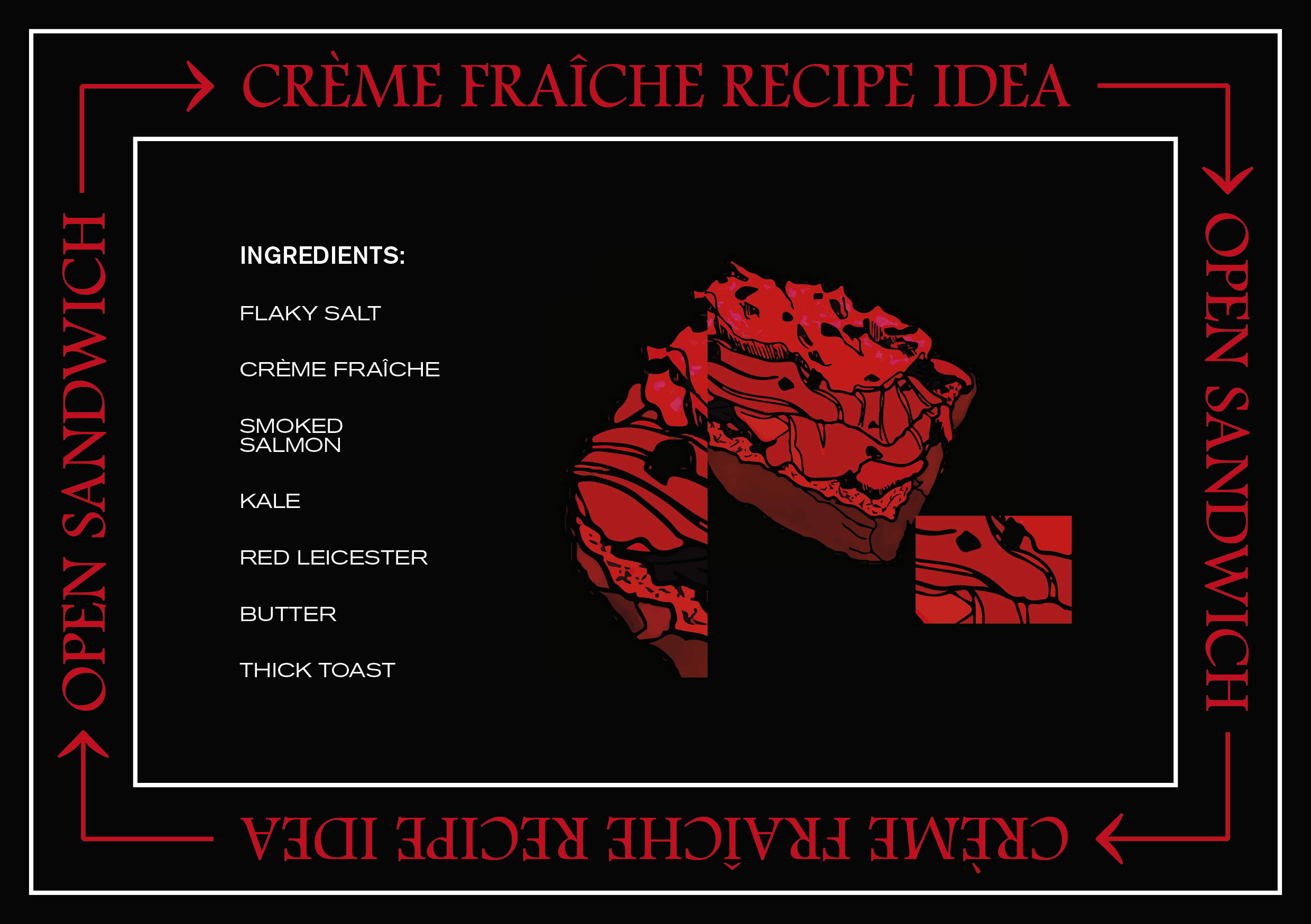
How To Make Crème Fraîche (+ More) By a Graphic Design Student
How To Make Crème
Fraîche (+ More) by a
Graphic Design Student
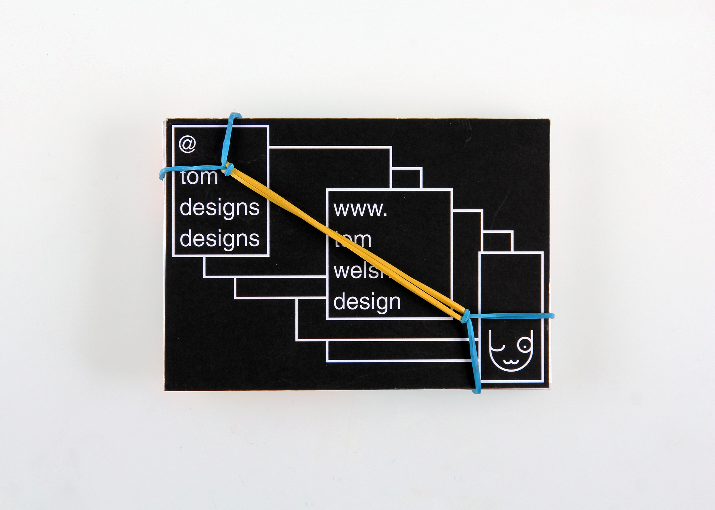
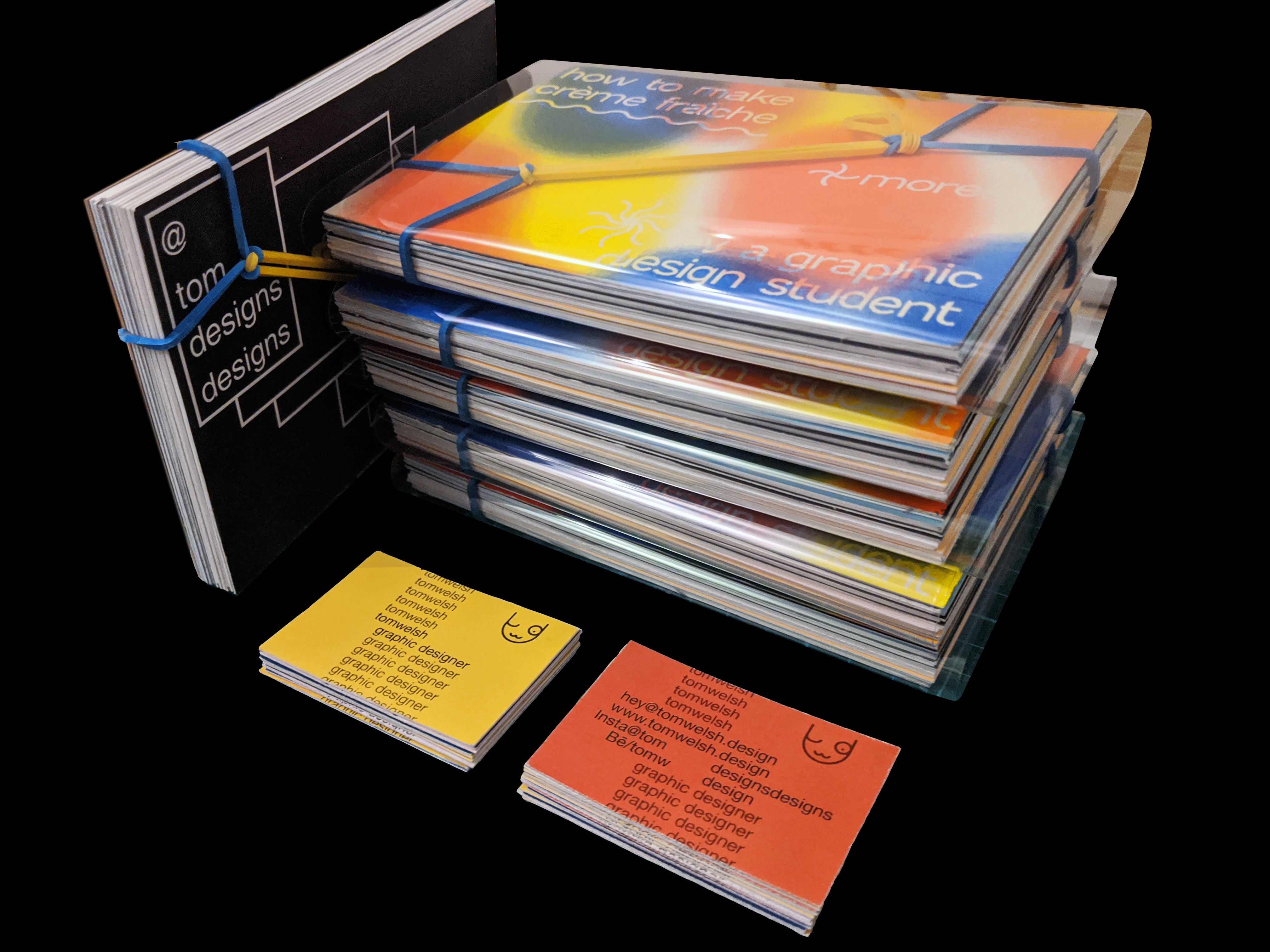
A rubber-band-knot bound card stack created for my university course’s table at The Tetley’s ‘Print, Perform, Present’ fair (2020, Leeds).
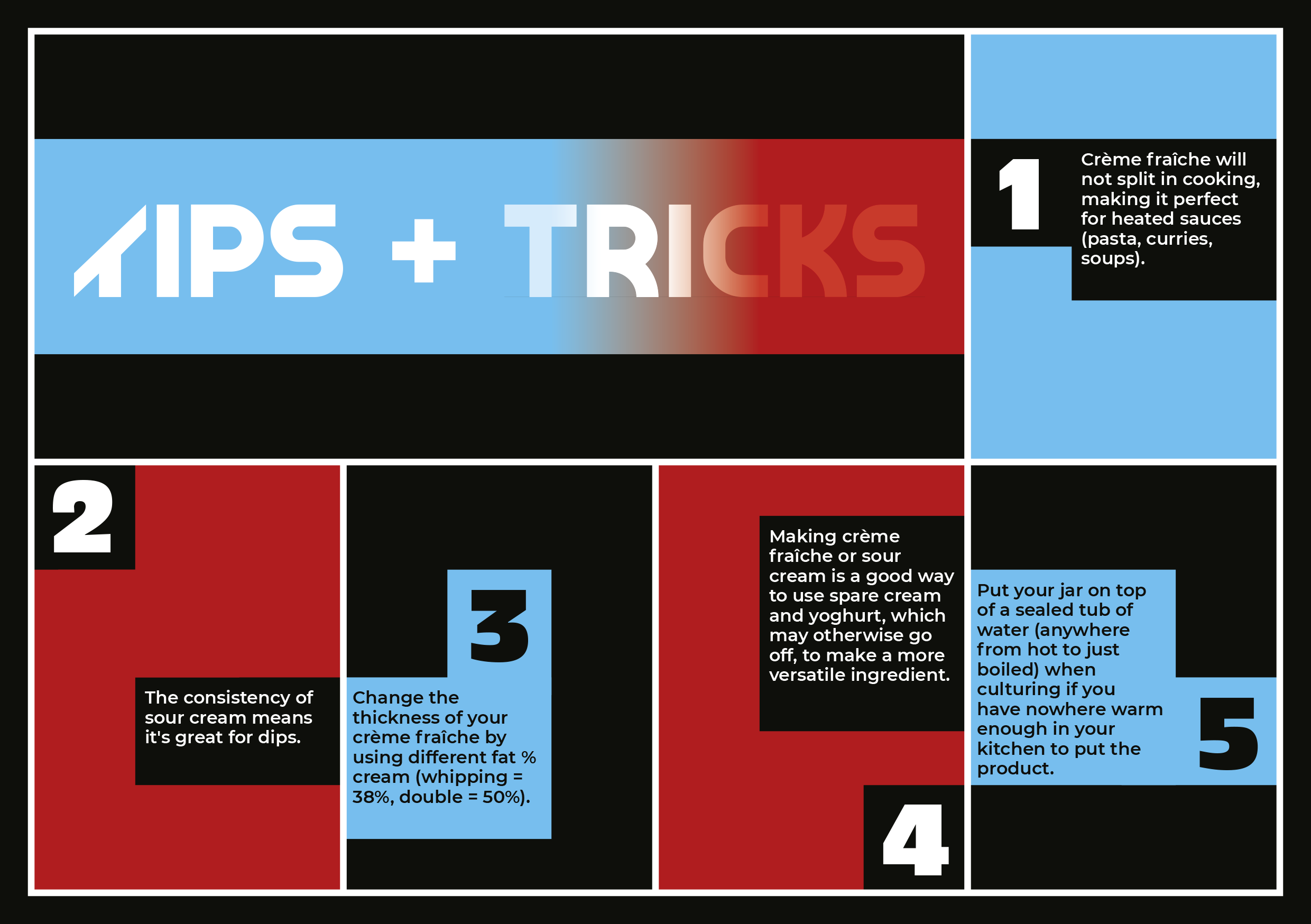
The work contains a method for crème fraîche and sour cream, along with suggested uses and recipes. Each card is designed in a different design style that would be appealing to a design student.
The cover is a four-colour risograph print backed with brown card, and the inner cards are digital print and backed with three layers of 250gsm cartridge paper from off-cuts.
I also created some business cards for the event that use a repeating motif, along with another design for cards I would keep on myself, to hand out – printed on the reverse side of unused covers from the main print piece.


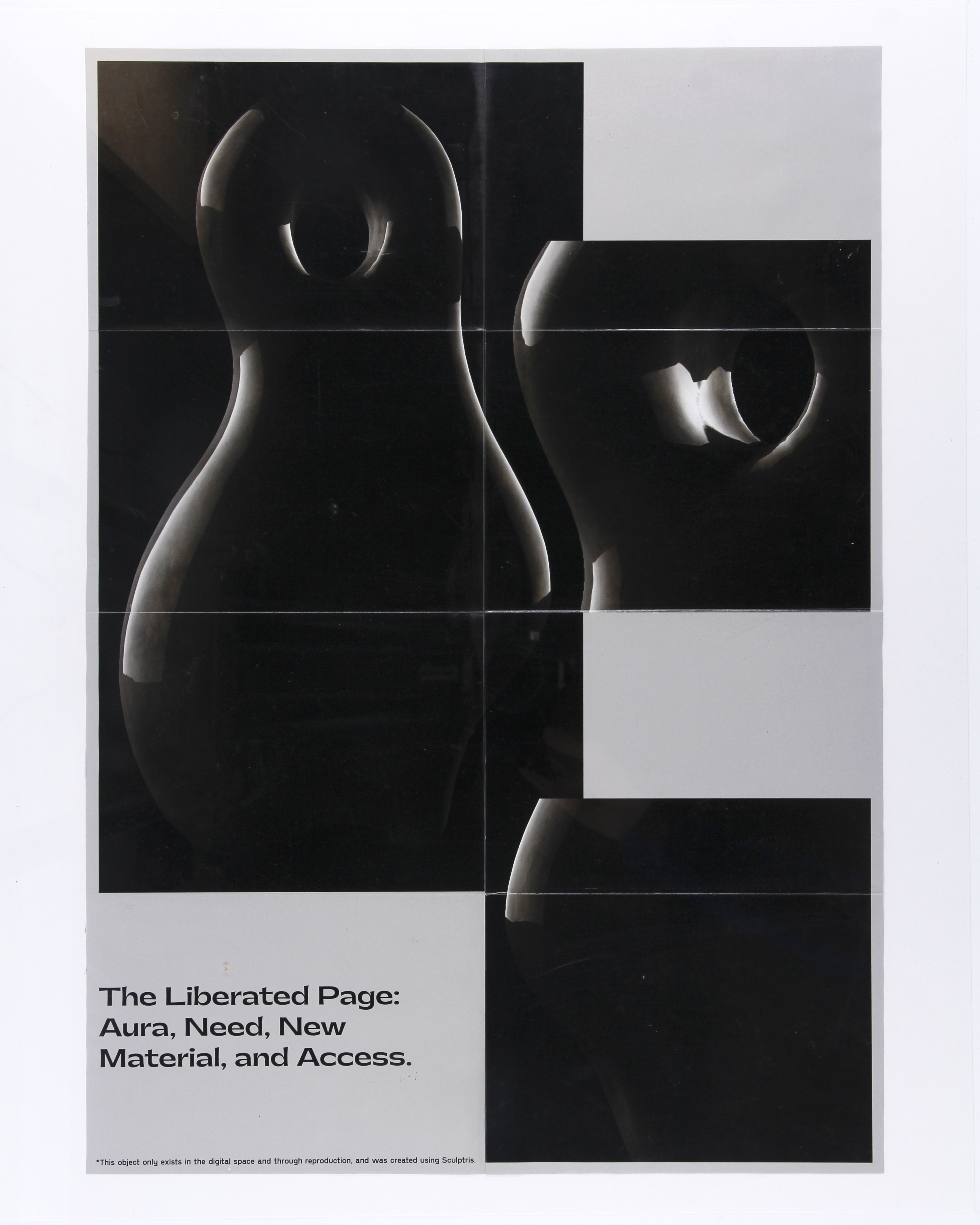
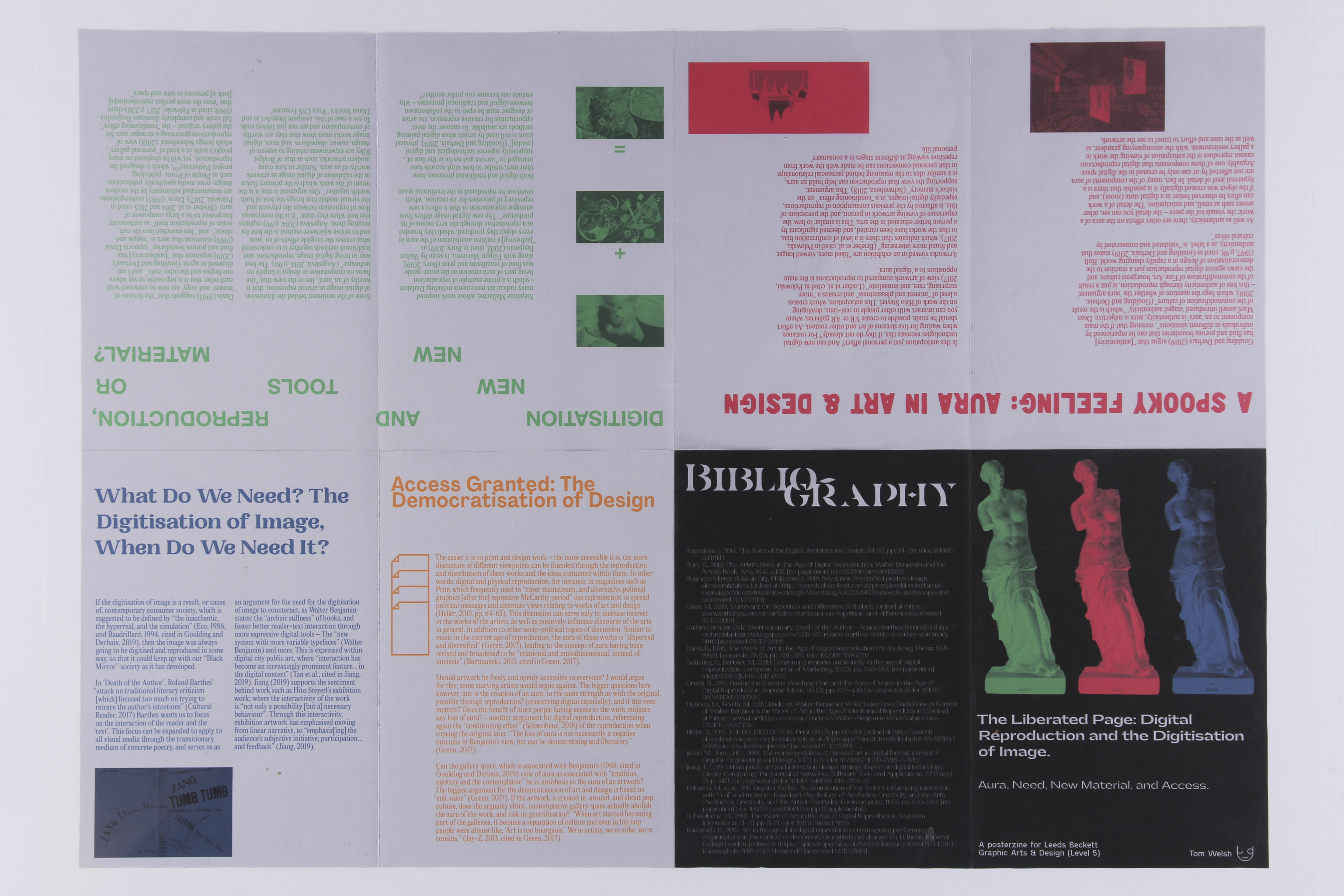
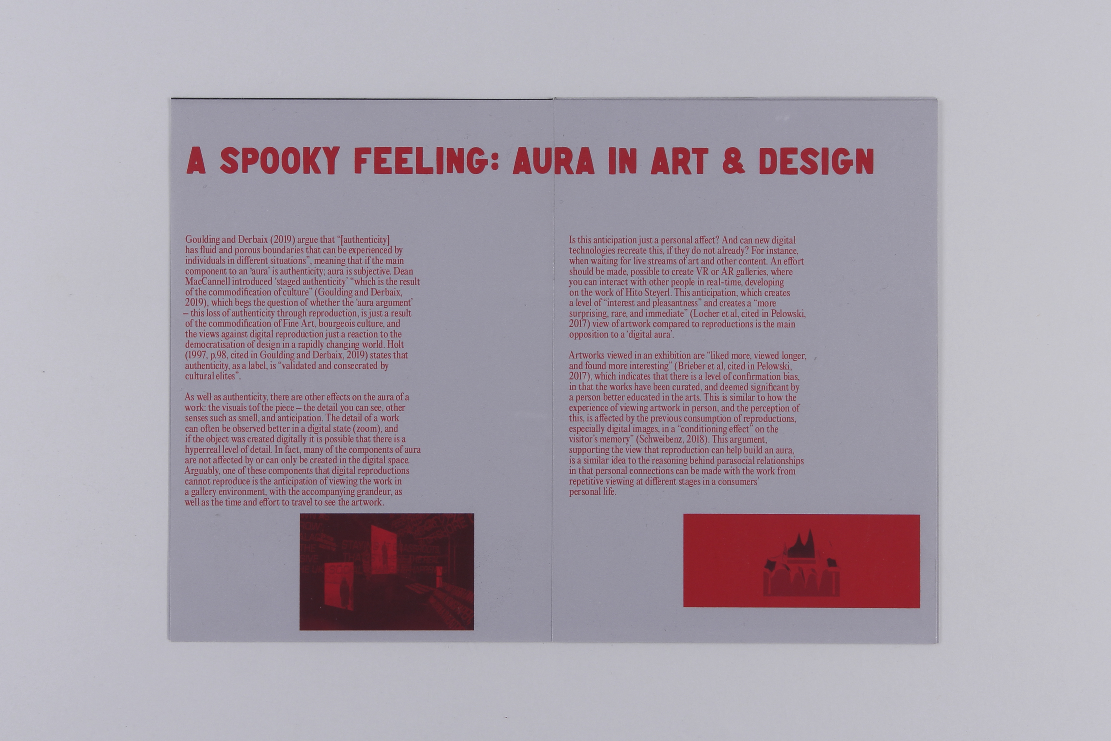
The Liberated Page: Aura, Need, New Material, and Access
The Liberated Page:
Aura, Need, New Material,
and Access
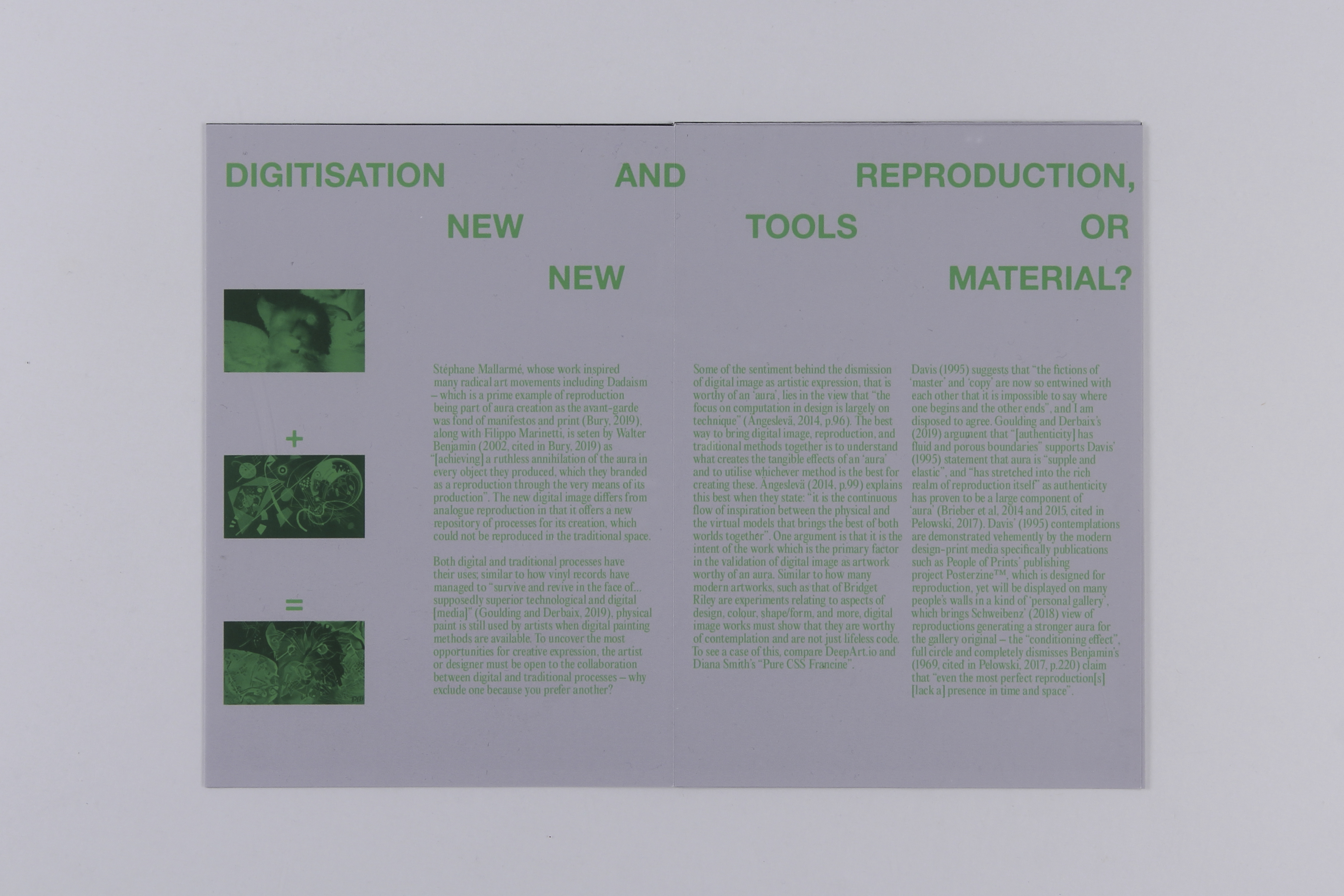
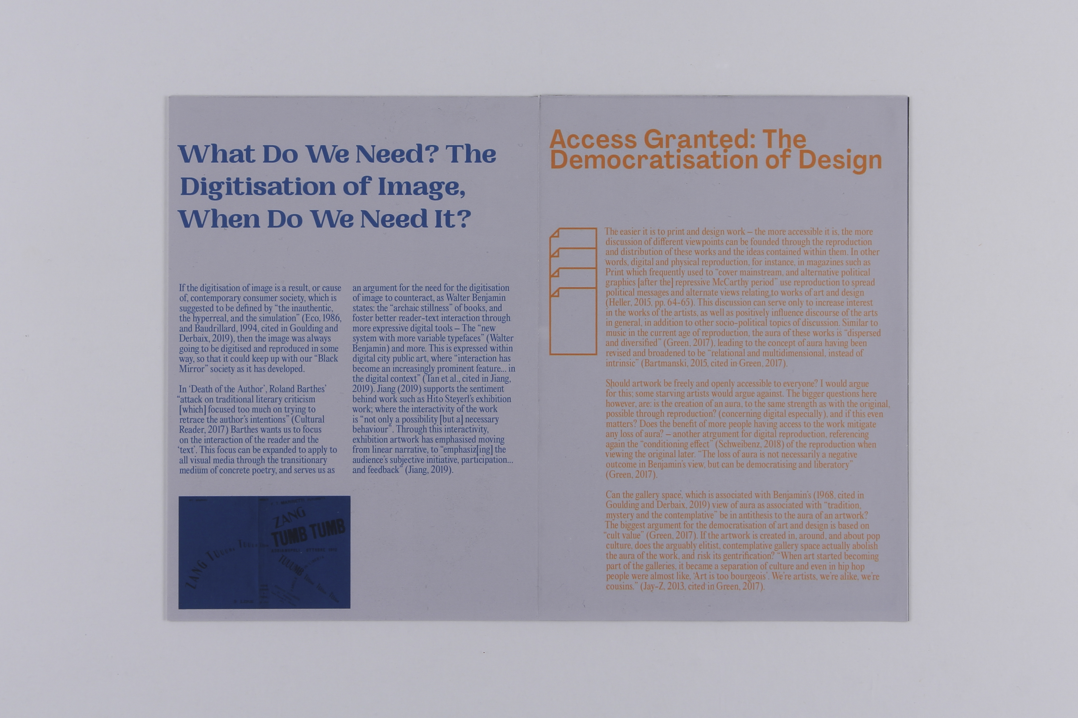
An essay focusing on how digital reproduction has influenced graphic design, and the benefits and drawbacks of the digitisation of image, presented in a posterzine format.
The essay text can be downloaded here for viewing.
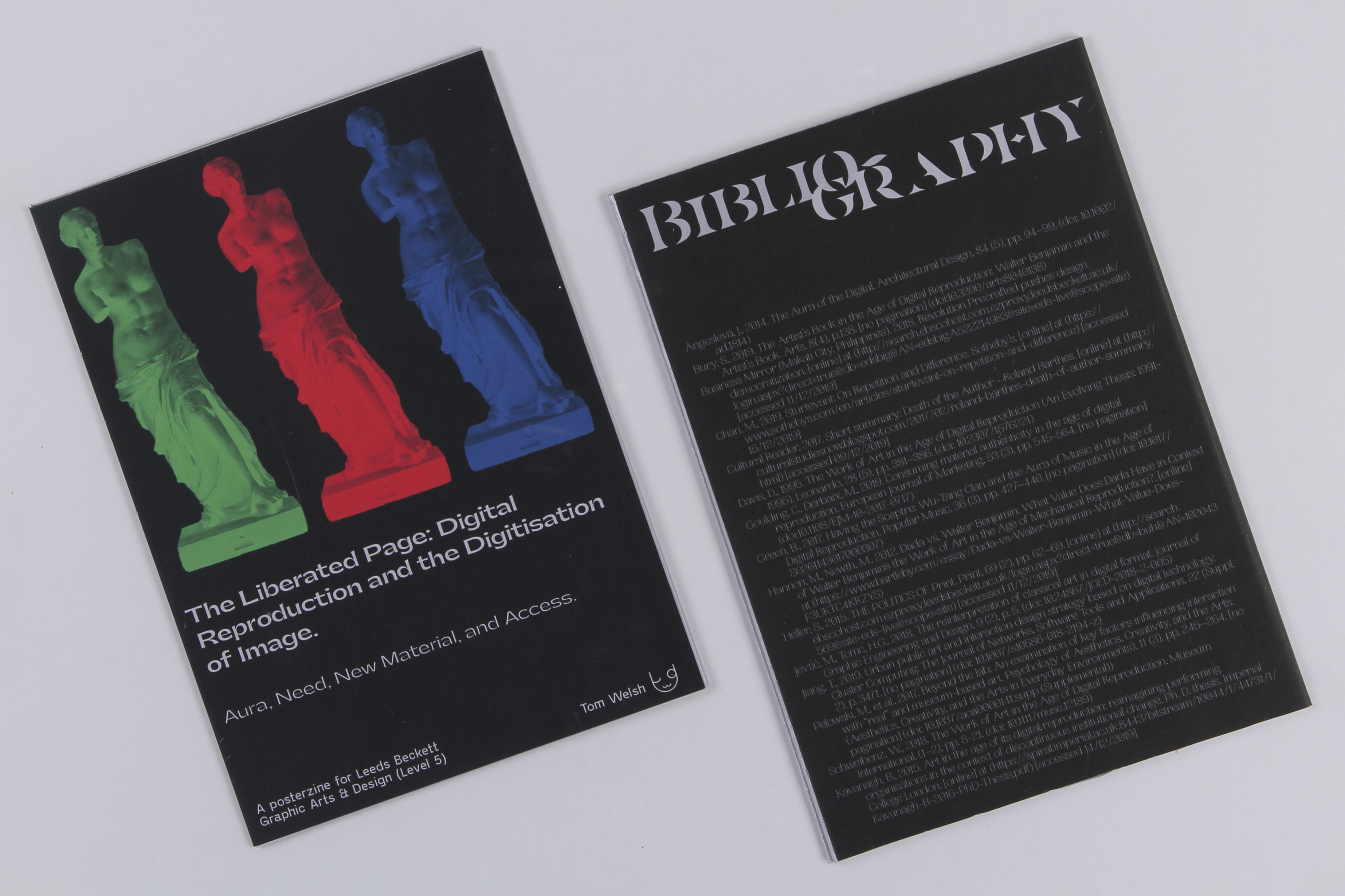
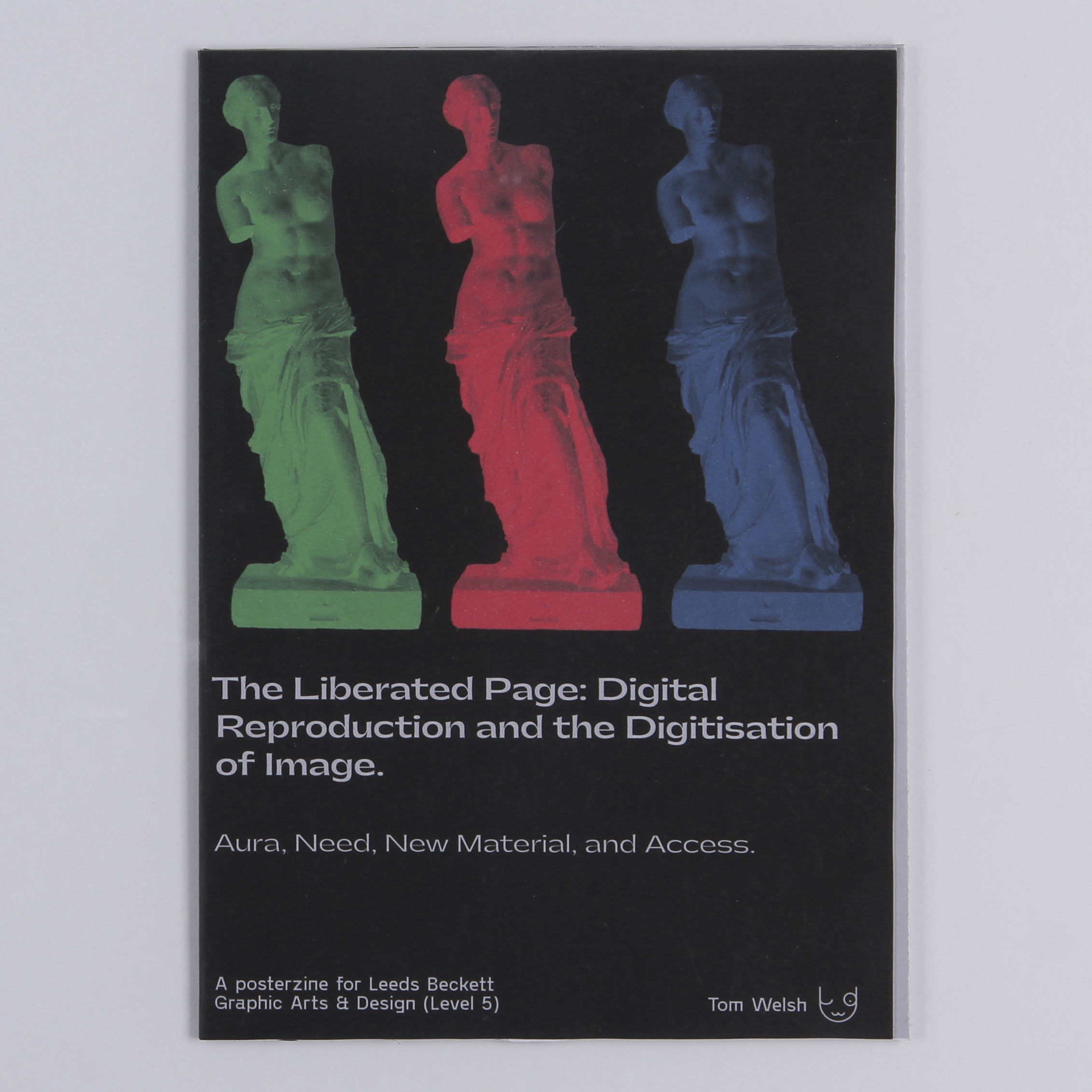
The cover features the Venus de Milo, a famous ancient Greek statue, re-apropriated and repeated using the RGB colour set, to represent the themes referred to in the essay title.
The A2 poster side of the zine presents a sculpture I created in Sculptris, the image exists only in the digital space and through reproductions, which serves to represent some of the points I make within the text.
A sticky-back glossy substrate was mounted to an uncoated 90gsm paper, with both sides being printed with inkjet, so that the sculpture (gloss side) is presented with good depth of colour and detail preservation, and the essay (matte side) is easily readable. Other versions with a 115gsm inkjet coated paper, and a thicker uncoated paper were made. For commercial purposes the best combination would be the glossy sticky-back substrate mounted onto a thin inkjet coated paper.
Strong RGB colours are contrasted to a stone grey throughout the inside pages, representative of the discussion on the contrast between older materials and artwork with new, digital material and methods of production.
The essay text can be downloaded here for viewing.
The cover features the Venus de Milo, a famous ancient Greek statue, re-apropriated and repeated using the RGB colour set, to represent the themes referred to in the essay title.
The A2 poster side of the zine presents a sculpture I created in Sculptris, the image exists only in the digital space and through reproductions, which serves to represent some of the points I make within the text.
A sticky-back glossy substrate was mounted to an uncoated 90gsm paper, with both sides being printed with inkjet, so that the sculpture (gloss side) is presented with good depth of colour and detail preservation, and the essay (matte side) is easily readable. Other versions with a 115gsm inkjet coated paper, and a thicker uncoated paper were made. For commercial purposes the best combination would be the glossy sticky-back substrate mounted onto a thin inkjet coated paper.
Strong RGB colours are contrasted to a stone grey throughout the inside pages, representative of the discussion on the contrast between older materials and artwork with new, digital material and methods of production.

︎ Manchester + Leeds, UK