
‘Neurodiversity within design workflows & workplaces’ essay zine
‘Neurodiversity within
design workflows & workplaces’ essay zine
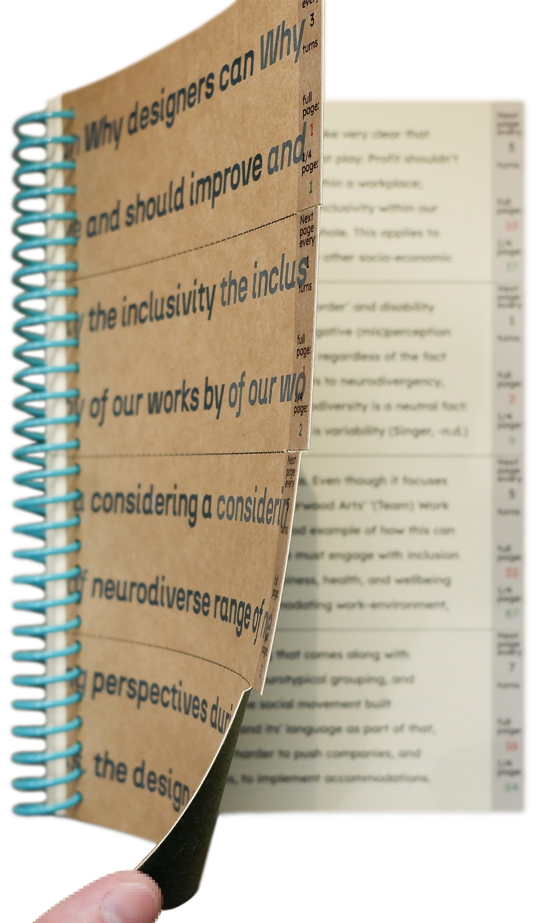
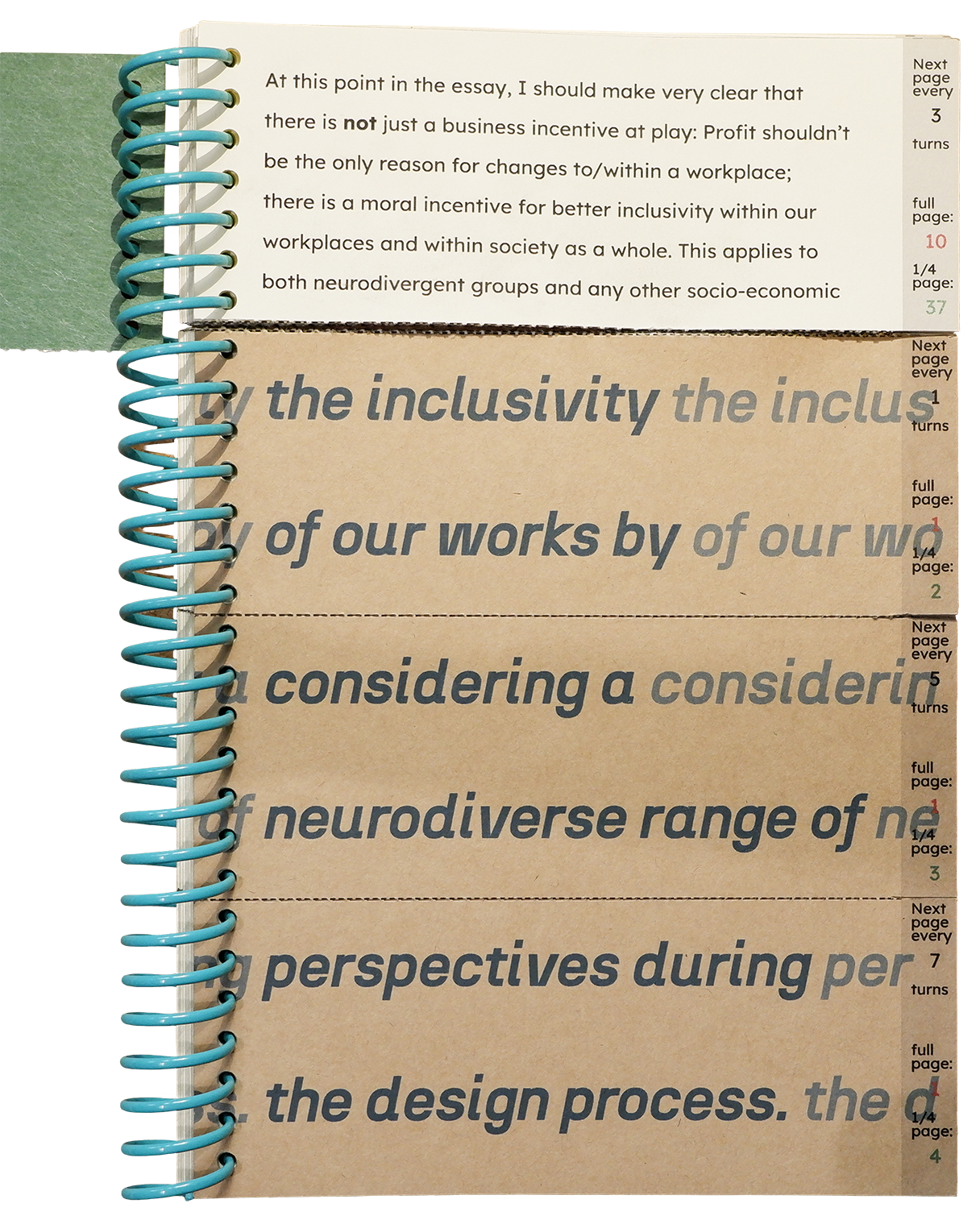
The zine design is made to demonstrate the experience that a neurodivergent person has when small adjustments for them have not been considered as part of the design process. It does this through the fact that the reader is unable to access the essay text before they are given a key – which is that each page of the essay is split into sections, so that the text is not in order, and you need to turn each section a certain number of times in order to read an entire page at once.
Having to tear the pages yourself represents a consumer having to make accessibility adjustments for themself.
The background colour was chosen as it is easier to read text on an off-white background as opposed to the strong contrast of a dark black on bright white. Similarly, I didn’t want the choice of fonts to be a factor in the work being hard to access.
Colophon:
Title: N27 (Bold Italic) 36pt. by Atipo.
Headings: Coolvetica (Condensed) 28pt. by Typodermic.
Body: Lexend (Deca) 12 & 9pt. by Shaver-troup, B & Google.
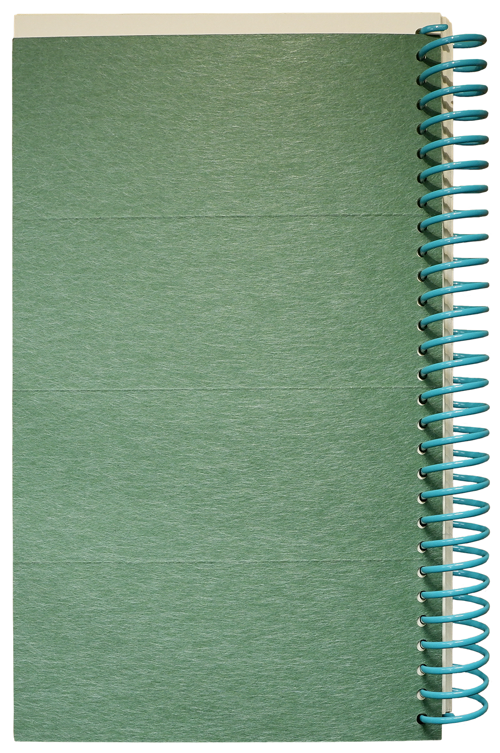
Cover: Takeo Kraft 120gsm & Takeo Tela (Pine) 80gsm laminated around G.F Smith Colorplan (Stone) 270gsm.
Book block: G.F Smith Colorplan (China White) 175gsm.
With perforated ‘tear here’ section lines and spiral bound using a teal/topaz 3:1 coil to allow 360° page turning.


︎ Manchester + Leeds, UK