
Subverted Jobcentre Plus advertising pack
Subverted Jobcentre
Plus Advertising Pack
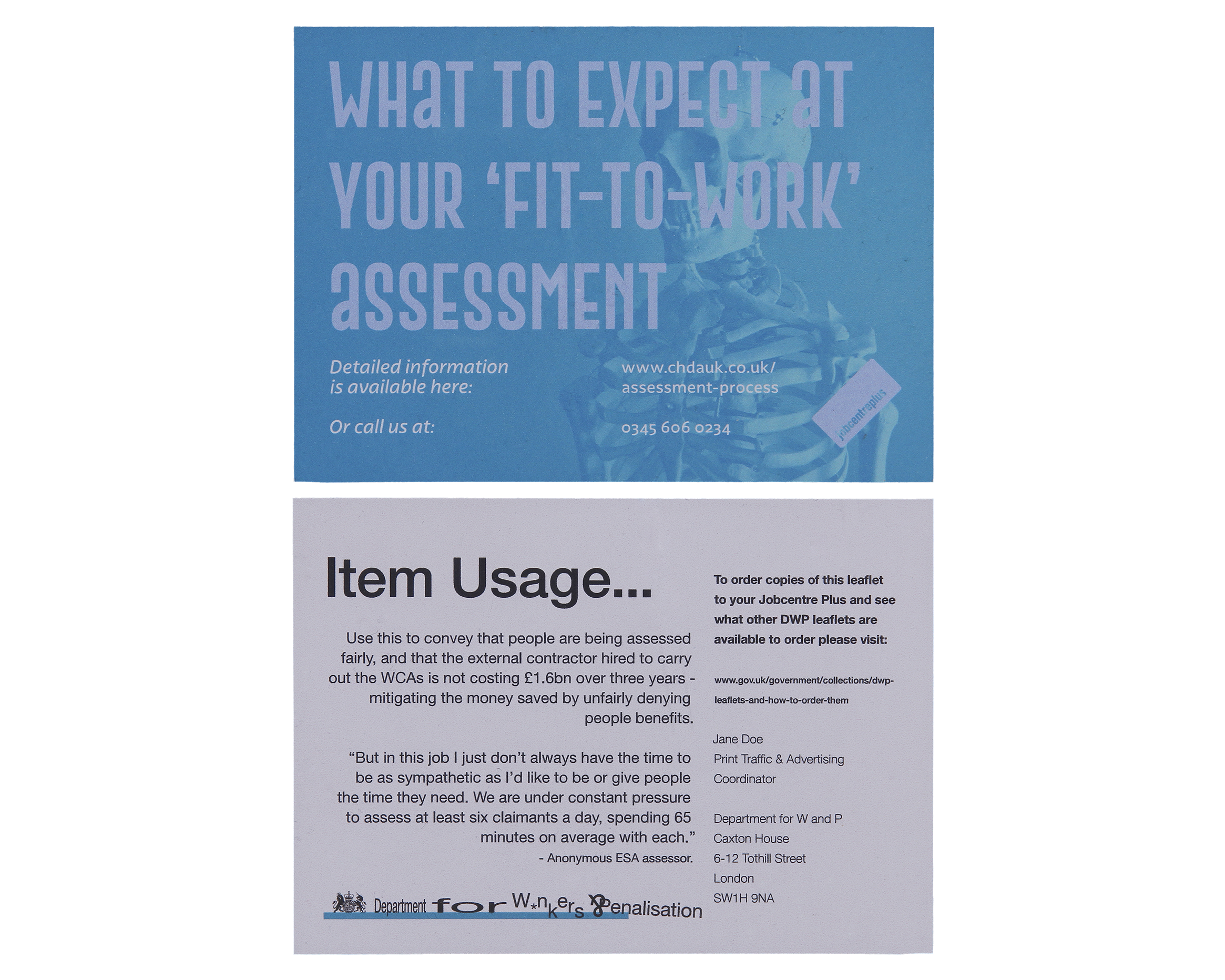
Though the project ostensibly displays advertising material for JobCentre Plus, satire shows through on the second look as you notice how tone-deaf the design language is.
For instance, the colour combinations used along with the contrast of the background images to the text make the words hard to read, especially for visually impaired people. This was done to hint that the department running the campaign has not considered the needs of the people they are tasked with helping.
Similarly, by using stock photos of happy and able people alongside optimistic taglines, the mistreatment that users of the service face is also glossed over.
In response to the tagline on its face, the reverse of each deliverable features the commentary of a fed-up dummy DWP employee that expresses the facts and events the designs are based on, which includes news stories and Google reviews. They subvert the DWP logo and brand guidelines for page layout as protest.


︎ Manchester + Leeds, UK